10 Best Data Visualization Tools and Software
Data visualization is the process of graphical representation of data in the form of geographic maps, charts, sparklines, infographics, heat maps, or statistical graphs.

Data presented through visual elements is easy to understand and analyze, enabling the effective extraction of actionable insights from the data. Relevant stakeholders can then use the findings to make more efficient real-time decisions.
Data visualization tools, incorporating support for streaming data, AI integration, embeddability, collaboration, interactive exploration, and self-service capabilities, facilitate the visual representation of data.
Here are 10 top-notch data visualization tools that are gaining market recognition for their impressive performance and usability.
Top 10 Software
1. Whatagraph

Whatagraph is a cross-channel reporting tool that helps businesses to track, measure, and analyze marketing performance with clients and teams. Users can automatically pull data from all of their marketing channels, create visual, engaging reports, and share them easily.
Created with digital agencies in mind, Whatagraph offers tools such as the ability to create weekly or monthly reports using data from multiple sources, create automated workflows for collecting data from marketing channels, collaborate on reports, and customize reports to match company branding.
With features such as automated data gathering from multiple sources, easy-to-build templates, streamlined visuals, report scheduling, and more, Whatagraph aims to help brands collaborate, communicate, and scale. The platform integrates with a range of third party platforms including AdRoll, Campaign Monitor, Google Analytics, Mailchimp, and more in order to gather data from multiple sources.
2.Tableau
Tableau one of the most widely used data visualization tools, Tableau, offers interactive visualization solutions to more than 57,000 companies.
Providing integration for advanced databases, including Teradata, SAP, My SQL, Amazon AWS, and Hadoop, Tableau efficiently creates visualizations and graphics from large, constantly-evolving datasets used for artificial intelligence , machine learning, and Big Data applications.
The Pros :
- Excellent visualization capabilities
- Easy to use
- Top class performance
- Supports connectivity with diverse data sources
- Mobile Responsive
- Has an informative community
The Cons :
- The pricing is a bit on the higher side
- Auto-refresh and report scheduling options are not available
3. Qlik
Qlik Sense empowers people to make better data-driven decisions and take action. The solution provides augmented analytics for every business need from visualization and dashboards to natural language analytics, custom and embedded analytics, reporting and alerting. Our unique associative technology enhances human intuition with AI-powered insights, offering unmatched capabilities for combining data and exploring information.
It indexes the associations in your data, and exposes related and unrelated values as you click, revealing hidden insights that would be missed by query-based tools. And it performs calculations as fast as you can think. Qlik Sense helps users move from passive to active analytics for real-time collaboration and action. And you get robust data integration, application automation and the convenience of SaaS with hybrid multi-cloud capabilities. See why we’ve been named a Gartner Magic Quadrant Leader for Analytics and BI platforms for 11 years in a row.
4. insight software

Insight is a salon and spa management solution that offers online booking, staff management and automatic notifications within a suite. The product is available both in cloud-based and on-premise deployment options. Insight allows users book and confirm appointments online via automated text messages and emails. The system also enables users with customer engagement by recording client preferences, tracking products purchased, service and appointment history and by rewarding loyalty points. Insight’s marketing tools include automated text messages and email campaigns, blogs and newsletters.
Users can also track customer birthdays, anniversaries and referral sources. Insight also allows users to track sales and staff performance by storing contact and employment details, setting up work schedules and restricting data access with administrative controls and passwords. Other features include inventory management, time tracking, payroll management, reporting, online payment processing and services management.
Pricing is subscription based for cloud and one-time for on-premise version.
5. DOMO
Domo is a cloud-based, mobile-first BI platform that helps companies drive more value from their data by helping organizations better integrate, interpret and use data to drive timely decision making and action across the business. The Domo platform enhances existing data warehouse and BI tools and allows users to build custom apps, automate data pipelines, and make data science accessible for anyone through automated insights that can be shared with internal or external stakeholders.
Pros and Cons
- “In general, Domo is very powerful and very easy to use, relatively speaking.”
- “There were very few cases on some of the tables, the data tables, where I wish there was an additional feature or two.”
6. Datawrapper

Datawrapper is a data compilation and visualization software that simplifies how you can present large numbers of data. It is mainly beneficial for journalists, software developers, and other design professionals that need to compile data in whichever format they need.
You can use Datawrapper by copying data from Excel, Google Sheets, or the web. Live-updating is also possible through uploading CSV/XLS files or providing a link to a URL or Google Sheet. Depending on the design and presentation style needed, users can choose different types of maps and charts. Datawrapper’s design is for it to be flexible enough to cater to several customized chart design fit for the newsroom. The software automatically converts data from CSVs, PDFs, and other web resources into aesthetically pleasing charts, tables, and maps, which requires no coding skills.
7. Plotly Dash

Dash is an open-source Python library that helps data scientists create web interfaces to leverage Plotly’s data visualization and analytics applications. It provides an intuitive UI for people of all technical skills to use data science and machine learning for data analysis, thanks to components such as natural language processing for predictive modeling. It enables data analysts to translate business requirements directly into custom web development.
MIT-licensed, it can easily run on local servers and machines. Its Enterprise version is available as a Platform-as-a-Service (PaaS) and can be easily deployed on proprietary infrastructure with SSO/LDAP authentication and app designing. The community version is available for free download, while the Enterprise version comes at a price and includes authentication features, server deployment and dedicated support.
8. RAWGraphs
RAW Graphs is an open source data visualization framework built with the goal of making the visual representation of complex data easy for everyone.
Primarily conceived as a tool for designers and vis geeks, RAW Graphs aims at providing a missing link between spreadsheet applications (e.g. Microsoft Excel, Apple Numbers, OpenRefine) and vector graphics editors (e.g. Adobe Illustrator, Inkscape, Sketch).
The project, led and maintained by the DensityDesign Research Lab (Politecnico di Milano) was released publicly in 2013 and is regarded by many as one of the most important tools in the field of data visualization.
The team responsable for the design, development and mantainance of the project is composed by DensityDesign , Calibro and Inmagik , who joined the team in 2019.
9. Highcharts
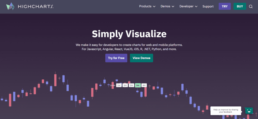
Highcharts is a Javascript charting library designed to help developers add interactive charts to any platform. With our wrappers, you can also implement Highcharts using the most popular programming languages (.Net, PHP, Python, R, Java), iOS and Android, and frameworks like Angular, Vue, and React.
their library offers additional products, such as Highcharts Stock, Highcharts Maps, and Highcharts Gantt. Developers can create stock or general timeline charts, link data to geography with maps, or visualize projects in Gantt charts.
The sophisticated Accessibility module, that comes with all our charting libraries, ensures that your charts meet common Accessibility standards.
Highcharts is a time saver for developers who want to visualize data on any platform.
- Highcharts is a javascript-based chart library and can be integrated on any platform through the Highcharts wrappers and add-ons.
- Highcharts documentation is presented to make it easy to integrate charts on their platforms.
10. Sisense

Sisense data & analytics platform is designed to make it easy to mashup data from across the entire data landscape and transform it into actionable analytics applications that can be embedded anywhere. The vendor boasts innovative startups and global brands like GE, Nasdaq, and Philips, as well as organizations worldwide are using Sisense to accelerate innovation and drive digital transformation by embedding Sisense into their businesses. Whether data is in the cloud, on-prem, or a mix of both, Sisense gives users everything needed to successfully deliver on analytics application strategy today, allowing you to:
- Securely connect and ingest data into cloud data warehouses to create a single store for your data
- Mashup data from dozens of sources for a complete view of your business
- Leverage a combination of live or cached data models to optimize performance and manage resource utilization
- Build beautiful visualizations and actionable application components using the robust library of integrated widgets and certified add-ons
- Develop and white-label with ease using a full suite of APIs and developer toolkits
- Differentiate products and services with fully integrated, white-label analytics in the office or on mobile devices for users on the go
Conclusion
Business analysts are the most sought-after IT professionals. Today, there is an increased demand for business analysts, but most organizations are facing a severe skills gap, failing to fill key roles. The rising shortage of new talent is a great opportunity for business analyst aspirants. Learning data visualization tools from an industry-recognized educational institution, such as Simplilearn, can enable them to grab better opportunities and get hired in their dream roles.