10 Best Heatmap Software for Websites and Apps
How far do users scroll on your website’s pages? Which content actually aids conversions? What distracts from the journey? Where is the user base located? How do they interact with dynamic menus, iframes, and elements?

Heatmaps are the answer! they are a very effective way to know what users do on your website’s pages, where they click, how far they scroll, what they look at or ignore.
In this list, we will introduce the Best Heatmap Software Tools for Websites and Mobile Apps, so you can see for yourself just how valuable and useful heat maps are.
Top 10 Software
1. Hotjar
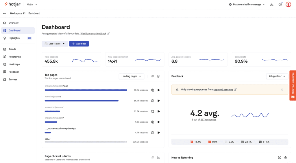
Hotjar Heatmaps collect anonymized user behavior, allowing you to get an overview of your visitor behavior while protecting end-user privacy. Heatmaps give you an at-a-glance overview of how people interact with a page. See how far they scroll, what buttons they click, and what content gets ignored.
Visualize user behavior with heatmaps, that visually represent where users click, move, and scroll on your site.
– Discover what attracts attention
See what elements users are drawn towards, and the parts they completely miss.
– Learn what gets ignored
Learn exactly where users stop scrolling and leave with scroll maps.
– Analyze behavior pre- & post-launch
See where users move, click, and scroll before and after you release a change.
– Compare desktop, tablet, and mobile
Learn how behavior changes depending on the device your user is on.
It can store heatmaps for 365 days, the world’s largest sites created over 7.5 million heatmaps on it. Hotjar’s Continuous Heatmaps let you filter data and create special heatmaps based on user attributes—like the user’s role or title, the date they created their account, whether they’re on a trial version of your product, and more—so you can quickly find targeted insights.
For example, product teams might use heatmaps to test how users are interacting with a new feature or prioritize bug fixes, whereas UX and UI designers will use heatmaps to measure the popularity or dislike of a page design, and implement changes that will make it easier for customers to navigate their website.
With Hotjar’s Highlights feature, you can ‘favorite’ and quickly share specific insights of a heatmap with other departments or individuals in your business, achieving successful cross-functional collaboration.
– Determine if your changes worked
Wondering if users are really engaging with your latest update? Heatmaps will show you if it’s capturing attention or getting ignored.
– Stop guessing where users click
Don’t let hunches determine how to improve your product. Get reliable data from real users to prioritize what you build.
– Spot issues you couldn’t predict
Find the issues that QA misses, whether it’s buttons that can’t be clicked or content that won’t load.
2. Smartlook

Smartlook’s heatmaps record 100% of all sessions by default with no data sampling. Let’s you see what works, understand user engagement at a glance without spending loads of your precious time. Get insights about what needs to be fixed and where, and improve conversions and user experience.
Smartlook offers 3 types of heatmaps:
– Click heatmap
Click heatmaps show you where people click. See whether there are unclickable elements that can be misleading for users, or clickable elements like CTAs that don’t get clicked.
Use insights from the aggregated click data to better optimize button placement and attributes, or turn unclickable elements like a free shipping icon, that get a lot of click activity, into a high-converting free shipping offer.
Click heatmaps are a great, quick way to get ideas for what to improve next by focusing on what is and isn’t working.
– Movement heatmap
Movement heatmaps, aka movemaps show you where people move their mouse on their screen. See aggregated cursor movement across any page based on mouse position data.
Use the insights from this type of heatmap to create a better page design by discovering where to best place images, content, and CTAs.
Movement heatmaps are a faster, cost-effective alternative to eye-tracking studies that allow you to utilize the existing user base.
– Scroll heatmap
Scroll heatmaps, aka scrollmaps show you how far users scroll on your website. See aggregated scroll movement data for long-form landing pages or product pages.
The information in this type of heatmaps will help you optimize long pages for the desired action by employing navigational cues to direct people to scroll as far as needed or by putting key information before the fold.
Scroll heatmaps will help prioritize what you want people to pay attention to by seeing exactly where on your page users drop off.
Generate a heatmap for important fragments of your mobile app in a matter of minutes! Segment your heatmaps based on date and see how users interact with every fragment in your app. It automatically organizes all heatmaps into galleries so you can see and access everything in one place.
3. Crazy Egg

Use Crazy Egg (one of the Best Heatmap Software Tools for Websites and Mobile Apps) to improve what’s working, fix what isn’t and test new ideas. To know what your web visitors are doing with tools, such as heatmaps, recordings, surveys, A/B testing.
See where people click and where they don’t with Snapshots. What’s a Snapshot?
Crazy Egg takes a snapshot-in-time of your webpages and generates five easy-to-understand reports that display your visitors (and users) click behavior.
You’ll learn a lot about your web design and how your customers interact with your page elements and layout. This is the key to unlocking page improvements that’ll increase your bottom line.
Crazy Egg Snapshots are interpreted by several different reports, each providing a unique and valuable look at how your visitors are engaging with your webpages.
– Heatmap Report
The originator in webpage heatmap technology. The Heatmap report is designed to quickly show you the highest areas of click activity on any of your webpages.
– Scrollmap Report
Know where your call-to-action sweet spot is. The Scrollmap report shows where the most popular scroll-depth of your webpage is – and that’s usually a prime spot for an important call-to-action.
– Confetti Report
For those of you who prefer a more precise look and want to see individual clicks on your webpages, this report is for you. The Confetti report displays color-coded dots that represent individual clicks and can be segmented by various metrics (time on site, OS, geography, etc.).
– Overlay Report
Know the percentage breakdown of clicks on all your webpage elements. This is helpful when it comes to determining which webpage calls-to-action are the most popular.
– List Report
The List Report is for those who want to see a purely numerical report of the number of clicks on their webpage elements. Sometimes you just need the numbers to slice-and-dice important behavioral insights.
4. Lucky Orange
Use Dynamic Heatmaps by Lucky Orange to track visitor behavior as they engage with pages across your website. Monitor engagement with forms, menus, and more. See which parts of a page drive conversions and which get in people’s way with Lucky Orange Dynamic Heatmaps.
Turn each page on your website into a conversion machine with the functionalities to get the job done.
– No Sampling
It tracks every visit, not just a sample, giving you a true picture of what’s happening
– Effective fold
See how far down the page 50% of your traffic is scrolling to optimize content layout
– Shareable screenshots
Share findings from heatmaps with your teammates using the easy download button
– Segmentation
Compare behavior across date ranges, traffic sources or other custom variables
– Visual customization
Change the look and opacity of your heatmaps based on analysis or presentation needs
– Compatability
Works on single-page apps, pages with authentication and sites with cross-domain rules
Optimization is made easy, no matter your business type.
– Lead generation
Adjust form fields and optimize CTA location to increase conversions
– Agency
Present the “aha!” moment your clients crave by showing actual visitor behavior
– E-commerce
Make store updates based on the behavior you see on product page heatmaps
– Enterprise
Provide evidence for which lines of the business belong in your main navigation
5. Glassbox
Glassbox helps you see and serve your digital customers more effectively by providing greater insights with less effort than traditional digital analytics tools. Get everything you’d expect from a heatmap tool and much more with Glassbox’s powerful interaction maps for your website and mobile apps.
See a complete view of how customers engage, optimizing your website or mobile app takes a granular understanding of how each page element affects user behavior. Glassbox captures and analyzes every interaction to reveal how users really engage with your site or mobile app. These in-page analytics provide insights that help you address user struggles, improve customer satisfaction and optimize the experience to increase revenue and conversions.
– Display all interactions and relevant metrics in a single view.
– Drill down into individual user sessions to validate your findings.
– Compare behavior across time, audience segments and A/B test variants.
Drive revenue with optimized content and layouts, Glassbox reveals opportunities to increase revenue and grow your organization through content optimization. In-page analytics show not only how many users are engaging with page content, but also the revenue impact each element makes along the way.
Measure the impact of content placement, identify where users struggle due to the placement of content on your page. Build funnels based on individual sessions to see how many other users are affected and the estimated revenue impact. Use AI-powered recommendations to improve layouts, elevate the customer experience and increase revenue.
Make informed investments, how customers engage with content is not only about placement—quality also plays a key role. Users will often skip or ignore content that doesn’t appeal to them. With Glassbox’s in-page analytics, you can clearly see the kinds of content your customers engage with most, allowing you to make informed decisions about what content to produce in future and how resources are allocated.
Understand how users engage with your content:
– Interaction maps
Gain more insight than heatmaps can offer. The interaction maps present a wide variety of metrics to give you a deeper understanding of how users engage.
– Zone analysis
Elements on a screen or page can be grouped into defined zones to provide another way of analyzing how users interact with specific areas of interest.
– Exposure tracking
Glassbox tracks how far users typically scroll down a page, revealing insights that help you to ensure content doesn’t go overlooked. You can also see what percentage of users clicked an element after viewing it to learn more about what inspires engagement from your audience.
6. Mouseflow

Mouseflow’s website heatmap tool records 100% of your traffic by default, instead of sampling only a fraction of it, like others do. Plus, it records every page — so you can retroactively analyze user behavior (for 3-12 months) without the need for manual setup.
The next generation of website heatmap software, a full suite of user behavior data visualizations. That has 6 website heatmap tools in 1:
– Click Heat map: A click heatmap shows you exactly where users are clicking on your website.
– Scroll Heat map: Scroll heat maps help with effective analysis of long or content heavy pages.
– Attention Heat map: Understanding attention can help you assess the effectiveness of the page design.
– Movement Heat map: Effective for mouse tracking to see where usability and conversions are most likely to be made. A movement heat map or movement map shows you where users navigate their mouse on your site.
– Geographical or geo Heat map: Identifies what regions, cities, and areas contain the most prospects for marketing or remarketing of your products.
– Live Heat map.
A friction score for easy heatmap analytics that pinpoint the heatmaps and users you need, instantly. Thousands of users, hundreds of pages, months of data — where do you start? With your website heatmap tool’s Friction Score.
Rely on automatic Friction Scores to call out the least satisfied users. Then, dive in and analyze the heatmaps with the most impact.
Conversion-driving data to optimize with confidence, don’t guess, backup your actions with visualized data and easily share heatmaps and session recordings with stakeholders to add visual context to your recommendations. Assure your team and empower collaboration, right from your heatmap tool.
Heatmaps enable you to balance quantitative data with qualitative data, providing context and nuance to your analyses. Where other tools only let you count the clicks on a button, Mouseflow also shows you what happens before, after and in between clicks. Bridge the gap from analysis to actionable insights and business recommendations by using data.
Mouseflow provides you with a lot of different functions that help you understand your users and read your heatmaps much better. You can filter your heat maps based on country, operating system, browser, traffic source, visitor type, screen resolution, device type, by date and much more.
7. Inspectlet
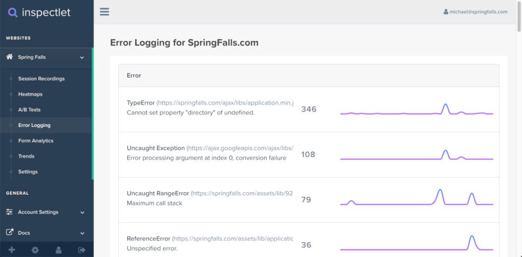
With Inspectlet’s eye-tracking heatmaps, see where your visitors are looking and what parts of the site they’re reading by visualizing their mouse movements. Find out where people are really looking, see what your visitors are paying attention to and what pages of your site they’re checking by visualizing their mouse movements with heatmaps.
Heatmaps are just one more way for Inspectlet to give you data about responsive pages. Due to the fluidity of responsive pages across different devices, layouts differ based on the screen size of the device being used which can lead to some discrepancies in your heatmap data out of the box for responsive pages.
To address this we’re introducing a technique that allows you to segment heatmaps based on the visitor’s screen size. Please note that this method is not needed for session recordings, session recordings will automatically pick up on responsive pages correctly.
Installing Inspectlet requires placing a simple Javascript code into your website. This requires little to no technical skill and can be done within a few minutes. Once installed, Inspectlet will immediately start recording user sessions and generating heatmaps out of the box.
Inspectlet has three kinds of heatmaps that are: eye-tracking, click, scroll.
– Eye-tracking Heatmaps:
See where your visitors are looking and what parts of the site they’re reading by visualizing their mouse movements. Research shows that mouse and eye movement are highly correlated.
– Click Heatmaps:
Find out what your visitors are clicking on, whether it’s a button, link, an image, or text they expected to be a link. Immediately see what’s working and what isn’t. Figure out which “buy now” button visitors are clicking more.
– Scroll Heatmaps:
Scroll heatmaps show you how far visitors are scrolling down on your site’s pages. Find out how many people actually make it to the middle or bottom of the page. Learn where on your page to place your most important content, like the purchase button or a special discount banner.
8. Fullstory
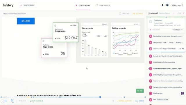
Fullstory‘s intuitive digital heatmaps provide you with critical insights so you can drive high-impact digital improvements & revenue. FullStory has a couple types of heatmaps which provide visual, aggregate data about how users engage with your pages.
Don’t settle for data that just tells you “what” happened. FullStory autocaptures every interaction retroactively so you have full visibility to also uncover the “why” behind issues and opportunities, and track key metrics over time.
Heatmaps are the easiest way to understand user engagement:
– See what catches users’ eyes
Check the pulse of any page on your site or app to see how users are navigating and exploring your content.
– Validate design and messaging
Watch where users are responding as expected or clicking astray to identify issues (and wins) with top navigation, page hierarchy, buttons, and more.
– Prioritize hypothesis testing
Examine scrolls and clicks, detect areas ripe for optimization, and collaborate with your team to ideate solutions.
When engagement maps are clear, so are your next steps:
– See the “why” behind user behavior patterns
If an element isn’t performing as expected, jump into one of FullStory’s diagnostic features like Session Replay to understand what’s going wrong.
– Draw insights from data you can trust
Click maps and scroll maps give a crystal-clear picture of user engagement without the confounding factors of screen resolution, dynamic page content, pop-ups, or confusing “splotches.”.
– Inspect specific user segments
Answer questions like “What do visitors from my ad campaign click on first?”, “How do returning customers interact with our navigation?”, or “Are users clicking on the latest product update?”.
9. VWO

VWO heatmaps help you see how visitors browse your website, what catches their attention, and which elements distract them. Follow your visitors’ trails with heatmaps, visualize click and scroll behaviors.
Heatmaps offer visual representations of how visitors interact with your website. From clicking elements to selecting an option from a modal box to browsing page content, a heatmap is a true representation of all visitor actions.
There’s five kinds of VWO’s heatmaps:
– Dynamic Heatmaps:
VWO heatmaps record visitor data on the live state of your website. Hence, you can easily view behavior on elements like modal boxes, pages behind logins, and dynamic URLs. The navigation mode lets you browse different pages on your website while viewing the visitor data on each element of these pages.
– Clickmaps:
Get real-time data on where visitors are clicking. Use the click data to find out key action points on your pages. And remove elements that distract the user.
– Scrollmaps:
Find out till what point most visitors are scrolling, and if they are missing out on anything important towards the end of the page.
– Click Area:
Select multiple areas on your page and compare the number of clicks between them.
– Element Lists:
Get click data for all the elements on your page by element ID/name (including hidden elements) to understand how much attention they are getting from users.
VWO heatmaps have a lot more:
– Add observations
Had a unique insight based on visitor behavior? Add an Observation and VWO will save your observation with the exact state of the heatmap where you noted the behavior.
– Download and share
Download the exact state of a heatmap and share it with your colleagues to uncover more insights.
– Always-on, real-time data
Be sure you never miss a single click. Your heatmaps continuously process loads of data at the back end to record and display behavioral data real-time.
– Cross-platform tracking
Choose the device of your preference. You can view heatmaps for visitors by using a desktop, mobile, or tablet.
10. Contentsquare

Contentsquare‘s Zone-based heat mapping analytics provides your team with a data visualization of the customer’s heatmapped journey. Discover opportunities in seconds with advanced heat mapping, reveal how users interact with each element on your website; understand what makes them click, what elements attract their attention, and what content makes them bounce. Go beyond basic analytics metrics to understand why your users behave as they do online.
Heatmap data uncovers page elements that drive results, an aggregated view reveals advanced in-page behaviors such as clicks, hesitations, and scrolls. Quickly discover the revenue and conversion rate of each page element, then use this data to deliver more successful experiences.
– Analyze heatmaps in the platform or directly on-site using the live zoning extension.
– Easily export and share heatmaps with digital teams and key stakeholders.
– Get more insights with shortcuts to Session Replay and Customer Journey Analysis.
Quickly analyze and optimize A/B test performance, understand at a glance which A/B tests performed better and why. Analyze the performance of key campaigns and testing variations, then take informed action based on ROI data and user intent.
– Compare two different test variations, devices, metrics, or customer segments.
– Learn the impact of different user behaviors and optimize based on what brings your business the most value.
Understand the ‘why’ of user behavior and answer experience questions fast. Get the data you need to answer optimization questions in seconds. One lightweight tag captures every interaction on every page, so you can analyze instantly with no need to re-tag your site.
Optimize your user experience at scale, understand the behavior of audience segments which matter most. Base site changes on real interaction data and tailor experiences to the intent of your most valuable customers.
Answer experience questions fast, get the data you need to answer optimization questions in seconds. One lightweight tag captures every interaction on every page, so you can analyze instantly with no need to re-tag your site.
Boost site performance, drive more conversion and revenue from the same traffic by knowing where to place content, product, and UX elements within pages and journeys. Identify which A/B tests are most important and compare results across tests and time.
Conclusion
Even if you use web analytics tools that can tell you about traffic sources and performance for your website or app, you need a heatmap software like the aforementioned to truly understand users on-site behavior. Heatmap software can lead to optimizations that increase conversions, conversion rate, lead quality, and more.